New shades of winter | Home interiors 2026
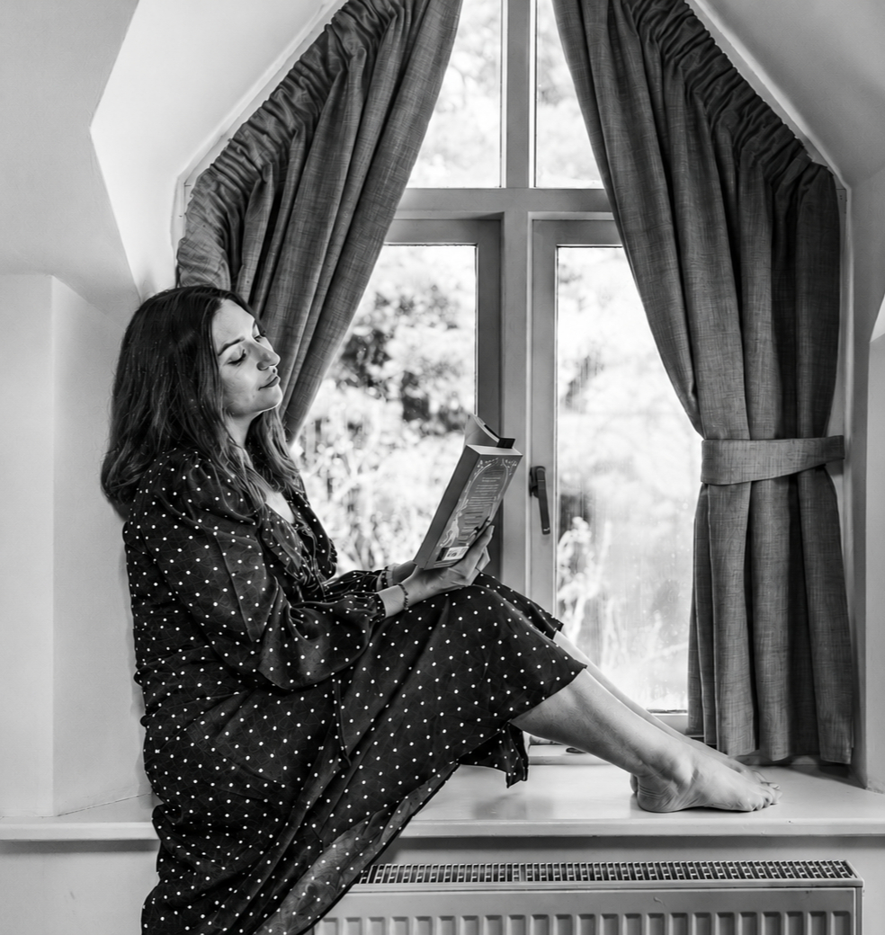
A mood-boosting seasonal palette predicated on unusual suspects
(*Originally written for and published on kartarandseibo.com)

Digital dumps and six second scrolls are rapidly eroding our attention spans. It’s the post-digital age and we’re hooked on furiously pawing at our devices for our next dopamine hit. Buried beneath the fast-consumption content that boosts our moods for six seconds lies something auspicious; something that still commands a slower, steadier, more committed wave of our attention. Deep within the catacombs of life beyond the internet we find exactly what we’re looking for to soothe our souls and slow our brains: our homes.
Life’s replete with stressors and distractions, so the role of the home is increasingly important. This season, there’s a steadfast devoutness to resurrecting it as the sanctuary it deserves to be. So, in the gloomy depths of winter, how does one reinvigorate the homestead as a mood-positive haven? Colour.
And upgrading your colour scheme in the winter has huge benefits, laying fresh foundations for the year ahead. Thanks to nature being stripped back to its bare bones, (she’s our perennial source of inspiration, after all), we covet a clean but comforting palette that can be up-regulated for cosiness and down-regulated for peace and serenity. So, your home can become the winter retreat of your dreams, ready to be adapted to future seasons, building the scaffolding for a more restful, self-compassionate space – even if you are on your sofa, scrolling on your phone.
Green peace
Our inherent desire to walk among the trees is demonstrated in this season’s symphony of greens. As we witness the world around us slip into slumber - and the beautiful bright shades of autumn drift away - we have a huge psychological void to fill.
Proven to naturally enhance your mood, there’s nothing a vibrant verdant palette can’t do. This season, earthier, ruddier shades replace summer’s obsession with soft sage. Unctuous shades of olive, forest, and moss green deliver the deliciousness you need this season. Lending effortlessly to upholstery and wall décor alike, it’s difficult to strike imbalance or asymmetry with green and other colours. We love to pair it with hints of gold for an opulent adaptation of this organic wonder, or grey for the cachet of contemporary cool.
Ravaged in red and rose
Usually reserved for the fall, winter’s traditionally glacial palette has taken a rosaceous turn. And the full spectrum is on trend and on hand to induct a dose of heat into your home interior. While most people don’t hold red in the regard of being a soothing, grounding colour, with the right shade, you can incorporate it as part of a serene interior space. Remember, red is replete in nature, (where we draw most creative inspiration from). where organic comfort is plenteous.
Rusty russets are ideal for living area feature walls, while the deeper wine-reds are perfect choices for indulgent interiors. And if you can’t quite brave a full-blown bold display, more muted, delicate rose shades are the perfect entry-level addition of winter’s unsurprising totem for calm and relaxation.
Drops of sunshine
Typically tied to swarthy memories of the seventies, this nostalgic colour is making a comeback as one of interior’s power players. An atypical choice for winter, ochre brightens up the darkest days when we crave a daylight prescription the most. Dopaminergic and really quite delicious, ochre is a sumptuous, mood-boosting addition to the interior space.
Fabulous all over upholstery for a statement look any time of year, this season, ochre’s sibling sunshine yellow is also having a turn in the spotlight. While this sits at the louder end of the spectrum, weaving it into the home interior is easy when paired with a supportive palette. Greys and cool metallics, blacks, and off-white neutrals provide a sound scaffolding for quietly and gently introducing sunshine yellow.
Winter’s new neutrals
More predictable? Sure. But equally as important, particularly for enhancing the longevity of this season’s less predictable key colours.
For neutrals, achieving the perfect shade of off-white isn’t the primary goal. Any shade of oatmeal or angel’s hair can still look flat without some elevation – ideally via texture. Sabulous sands, waxy whites, and organic oatmeal’s are instantly upgraded when they’re more haptic and texturized. A bit of boucle, a layer of linen, or some fabulous fringing and any neutral home décor item is a work of modern art. Pair with sculptural shapes and frames on furniture for an uber modern look.
But let’s not discount how the conception of what constitutes a neutral has evolved past prosaic white and beige. Evolution in colour theory and a rekindling of our romance with our natural environment means neutrals continue to adapt to our emotional needs – which can dictate the order and orientation of our homes. Soft shades of minerals and myriad oceanic glimmers of blues and greens create a panoply of fresh, inspirational neutrals, easily integrated into the home living space. From the bathroom to the dressing room and home office, no neutral is off limits when it comes to fabricating the ultimate winter interior that communicates with all other seasons too.


Comments